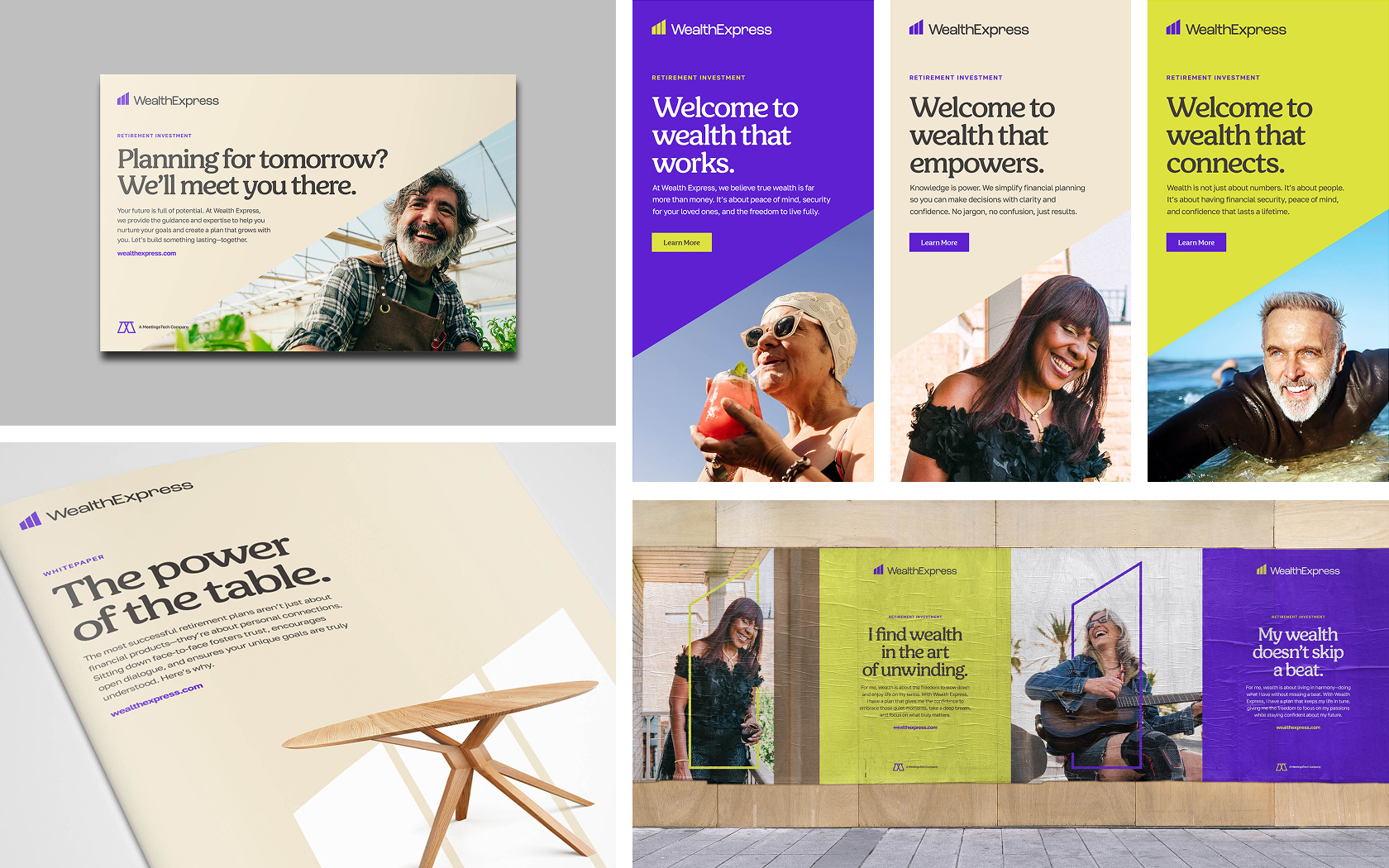
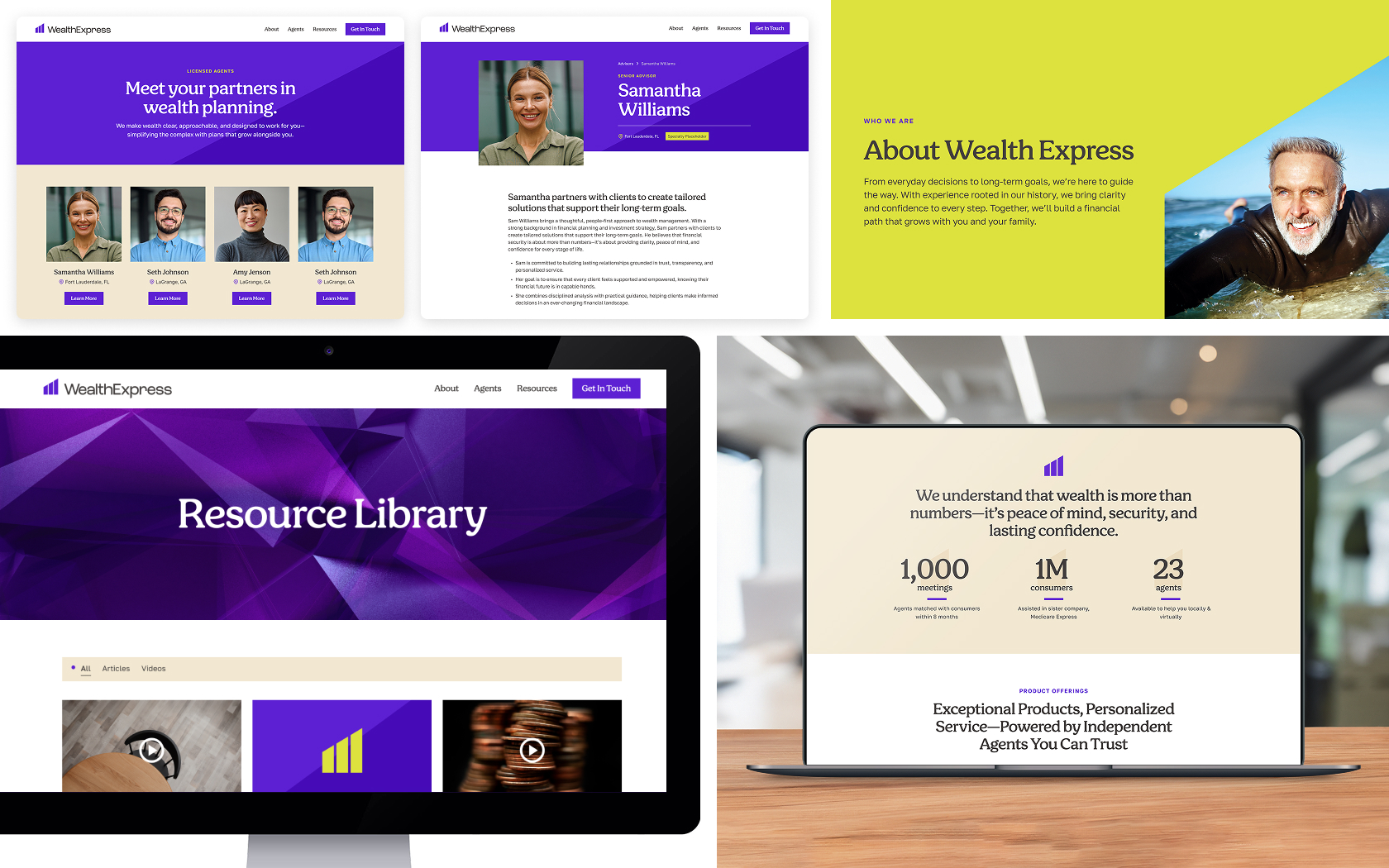
Services Provided:
Brand Identity
Brand Messaging
Brand Positioning & Messaging
Brand Strategy
Identity Design
Information Architecture
Templates & Design Systems
Website Design

Wealth that works.

Wealth Express arrived with a mandate to shatter the conventions of the financial services industry. The challenge was monumental: build a brand that could command trust in a crowded market, dismantle skepticism around its core products, and connect with hardworking Americans who felt ignored by Wall Street. We answered with a defining idea—"Wealth That Works"—and forged a rebellious brand identity designed to radiate confidence, simplicity, and unwavering dedication to the client. This is the story of how we built a brand from the ground up, equipping Wealth Express to dismantle the status quo and deliver financial peace of mind to Main Street.

A powerful new symbol.

The Wealth Express logo brings together a strong "W" and an upward arrow, signaling growth, direction, and security. Its clean, unified lines are meant to feel approachable yet reliable, moving away from the vague marks so common in finance. Alongside the primary logo, the monogram distills these same elements into a compact mark that works well both online and in print. The monogram’s flexible design opens up a wide range of creative applications—serving as a foundation for scalable graphics and dynamic brand experiences across all touchpoints. It acts as a trusted signature, reinforcing the brand’s commitment to a personal, supportive relationship with each client.

"They documented every idea, considering each one when selecting our company name, values, and other elements"

Department Coordinator, MeetingsTech

A highly scalable messaging framework.

The messaging framework is built around "Wealth That Works," presenting wealth as a journey—active, adaptable, and designed to evolve with you. This approach doesn’t just stop at one idea; it flexes to become "Wealth That Protects," "Wealth That Empowers," or "Wealth That Connects," giving the brand language that scales to reflect all the outcomes and values wealth can create. By treating wealth as a path you shape—never just a finish line—the messaging stays straightforward and relatable. It helps clients cut through confusion and see wealth as something that can work hard, grow, and serve their real goals at every stage of life.

A friendly new look.

We deliberately shattered the tired visual clichés of the financial world to forge an identity that resonates with everyday Americans. Instead of manufactured images of couples wistfully staring off into sunsets, our photography captures life in motion—real, vibrant, and unapologetically human. We chose to showcase the energy of Main Street, the warmth of a family gathering, and the quiet confidence of people in their element. This approach creates a look and feel that is not just approachable but alive, grounding the brand in the authentic, hardworking spirit of its clients and defiantly rejecting the industry’s tired, impersonal aesthetic.

A visual identity designed to scale.

We created a visual identity system that brings consistency across marketing, communications, and sales. Its key features include angular designs derived from our monogram, adding energy while maintaining cohesion. A carefully chosen, friendly typeface ensures our headlines are approachable yet professional. We also developed a disciplined color palette to complement the design. Every element—font, color, and layout—works together to ensure clarity and flexibility. This system allows us to present metrics, testimonials, and messages in a clear and cohesive way, ensuring the brand remains unified, relatable, and visually strong wherever it appears.

A bold new website experience.

The website was designed to embody "Wealth That Works." We streamlined the typical financial website structure, replacing complex navigation and overwhelming text with clear, intuitive pathways. The design is clean and compelling, using a strong, professional color palette that commands trust while remaining approachable. Every element, from the prominent "Wealth That Works" tagline to the straightforward calls to action, guides users. The site introduces new audiences to their value proposition, helps them understand their financial options, and connects them with licensed agents, establishing Wealth Express as a credible and accessible resource.

A wealth of knowledge.

This digital front door was built to be an educational powerhouse. We designed a dedicated hub for webinars, videos, and simple guides that demystify products like IULs and annuities. The content strategy is proactive, directly confronting skepticism and arming consumers with the knowledge to make confident decisions. The site doesn’t just sell a service; it launches a movement. It is a declaration that financial security is not a privilege for the few, but a right for everyone willing to take control, and Wealth Express is the undisputed partner to lead them.

And we're just getting started.

The new Wealth Express brand is just being stood up, and it is going to be supported by a wealth of digital and other types of marketing to build up their audiences, grow their agent base, and continue to offer new solutions for clients.

Previous
Next