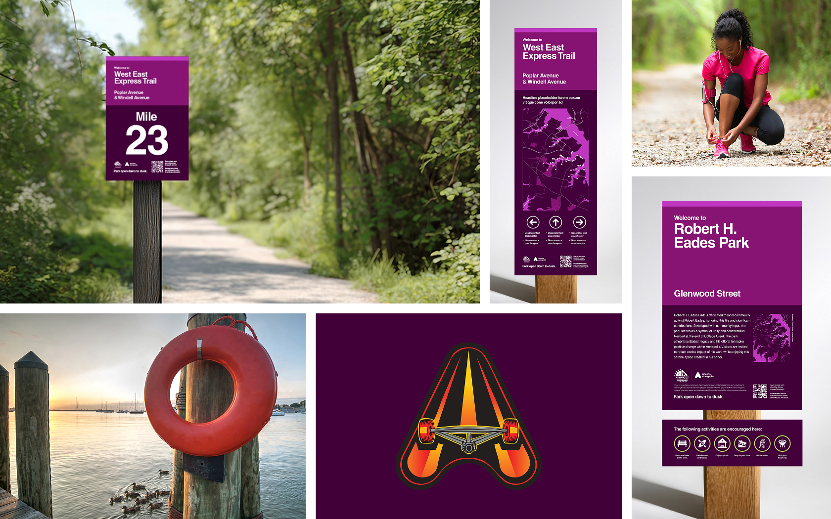
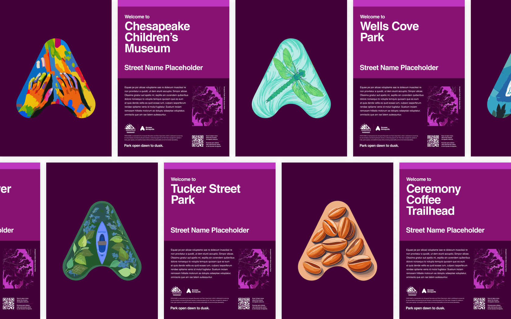
Setting the standard.
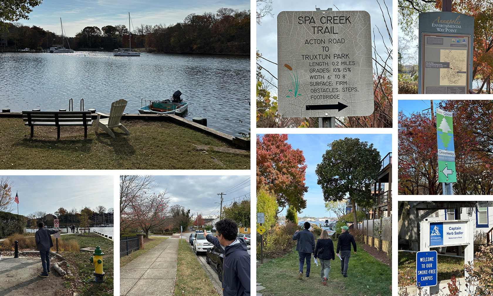
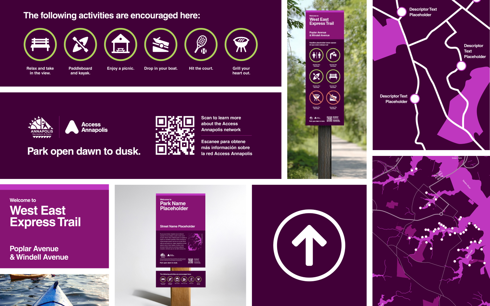
The City of Annapolis faced a significant challenge in addressing inconsistent, outdated, and inadequate signage across its public water access locations and various disconnected trails. As part of its first-ever citywide Public Water Access Plan, the City sought to create a cohesive signage system to enhance community engagement, promote responsible use, and align with existing branding.

A new system emerges.
With diverse site conditions and spatial constraints, Annapolis needed a versatile solution that could adapt to varying needs while maintaining consistency. The signage needed to do more than simply direct—it had to welcome and orient people, creating a sense of place, accessibility, and inclusion. To meet these goals, the project team conducted a series of stakeholder interviews and site tours, gathering insights from community members, city officials, and other key voices to understand the needs and priorities of a diverse audience. The resulting design framework balances form and function, ensuring the signs communicate effectively while enhancing the aesthetic quality of public spaces.

It began with a field trip.
Our process began with an immersive field trip to explore the existing signage throughout Annapolis. We walked the city’s streets, trails, and waterfronts, assessing both vehicular and pedestrian signage to identify improvement opportunities. Visiting a range of water access and trail locations, we documented signage needs, site-specific considerations, and the unique challenges at each area. This hands-on exploration gave us invaluable insights into the types of signs required, the information they must communicate, and the optimal materials and placements for each site.

Which turned into a design system.
The new design system was built with a focus on scalability and clarity, aiming to create a welcoming, visually engaging experience that highlights Annapolis’s deep connection to its people and the water. Recognizing that each location had unique requirements, we developed flexible solutions tailored to both water access and trail access signage. This meant considering distinct information needs, maintenance language, and supporting logos, as well as a range of sizes and sign types to meet site-specific demands. By prioritizing readability, accessibility, and consistency, we ensured the system could be easily replicated across all locations while maintaining a high standard of quality.
Built to scale.
Scalability was a central requirement for success. The standards were developed to adapt across diverse public water access locations—from small trailheads to larger waterfront parks. Our discovery process identified over a dozen different sign types, each with multiple permutations for size, aspect ratio, and communication needs. The system’s modular approach made sure that the City could respond to new locations, expansions, and evolving requirements without compromising on visual integrity or functionality.

And oriented around one signature element.
A key feature of the system was the introduction of the signature “A’s,” a concept first developed as part of the Annapolis Access Annapolis initiative. This graphic element serves as a visual mask, with unique illustrations designed to capture the heart of each location’s historical and cultural identity. The signature "A" helped transform every site into an Instagrammable moment, and built a sense of pride and connection among residents and visitors.


