Services Provided:
Website Design
Information Architecture
Brand Refresh
Interactive Consulting

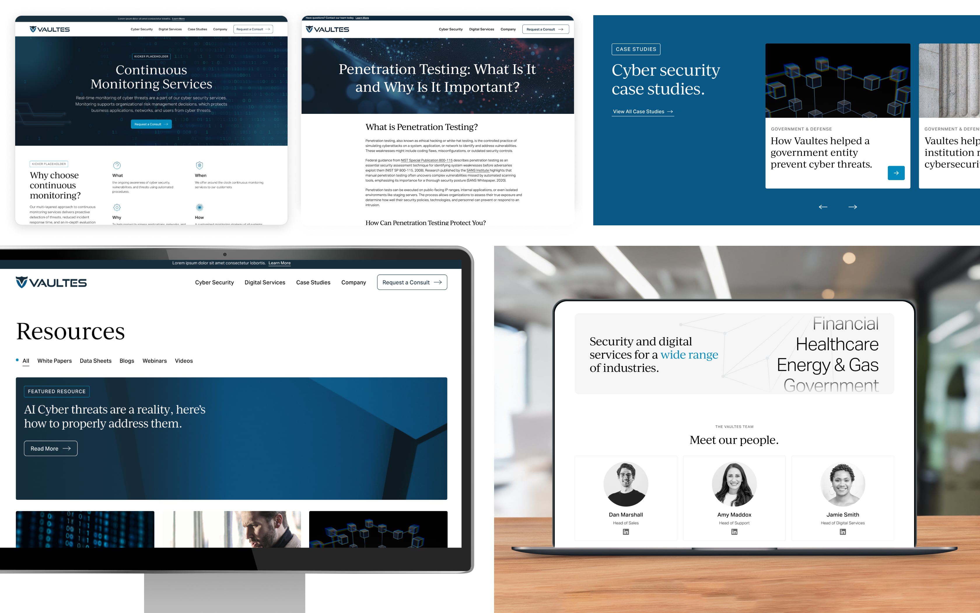
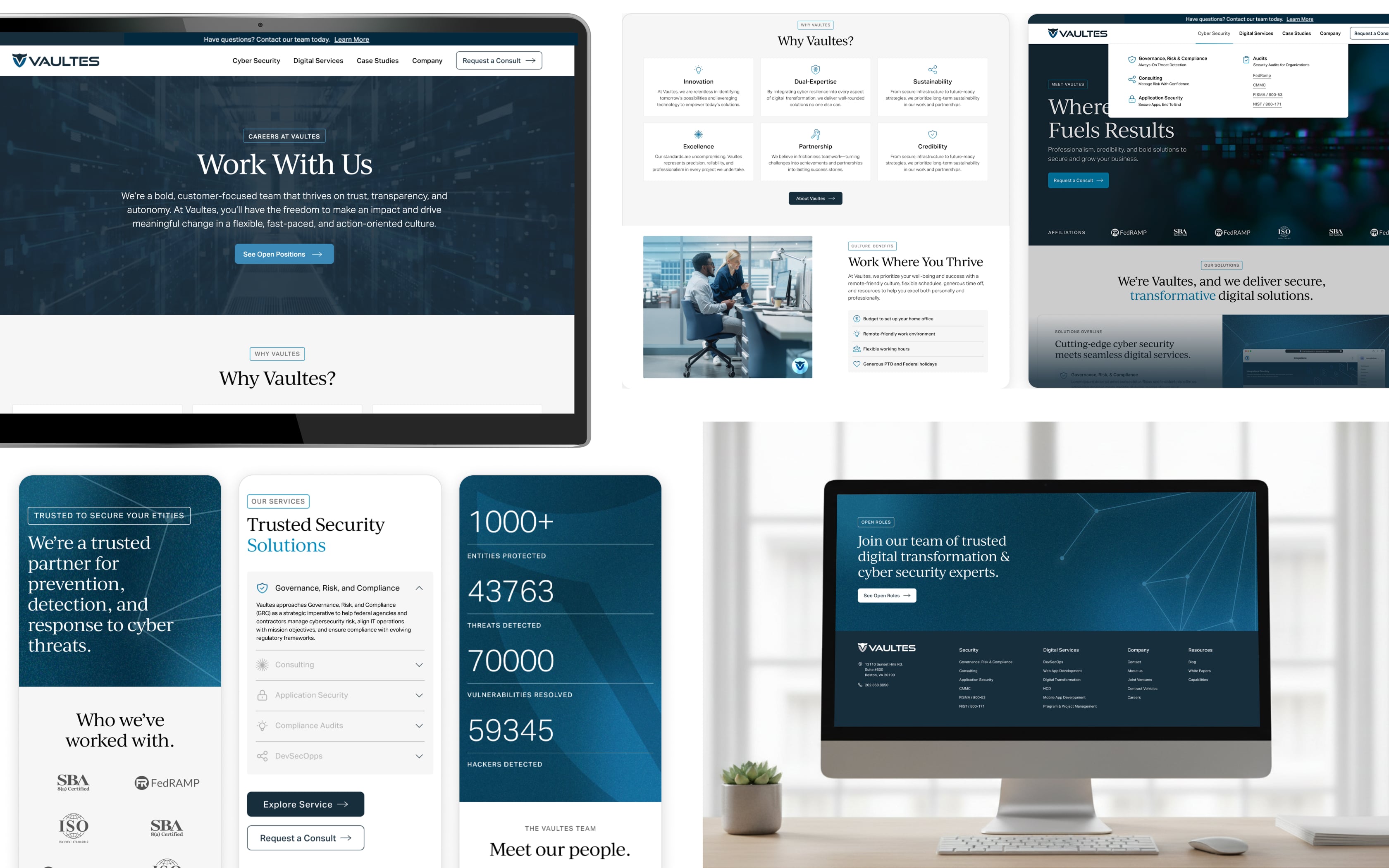
Crafting a human-centered cybersecurity presence.

Vaultes, a leading cybersecurity organization, was looking to refresh their brand and their website. They had an existing look and feel that had been developed, but wanted to bring it alive in a whole new way. That’s where Contrast came in. Partnering closely with Vaultes, we set out to redefine what a cybersecurity brand can be—bold, modern, and truly human at its core. With limited starting assets, we expanded their visual language and crafted a digital presence that is both warm and trustworthy. The result powerfully sets Vaultes apart from larger, impersonal competitors, building a genuine sense of connection with clients in both government and commercial sectors.

A need for a new identity.

Vaultes’ existing website lacked a clear brand identity, warmth, and meaningful differentiation from larger competitors. They had a very limited brand toolkit that consisted of a logo, a few cool-toned colors, and minimal visual direction. The site needed to balance cybersecurity credibility with a more human-centered narrative that reflected their client-first culture, and resonated with both government and commercial audiences. They also required a scalable design system and visual style that could grow with the company over time.

A more intuitive user experience.

We conducted a full site crawl to identify content gaps and dated content, redundancies, and opportunities to simplify and streamline the information architecture. From there, we reworked the site structure and navigation to create a clearer and more intuitive framework that aligned services, capabilities, and company information into logical, user-friendly pathways. We also produced low-fidelity wireframes to define component structures and content hierarchy, ensuring the overall site experience felt intuitive and easy to navigate at every level.

Built around the brand.

We repositioned the brand around its strongest differentiator, genuine client partnership. The website emphasizes the people behind the technology, highlighting key benefits such as collaboration, trust, and humility. We used brand-adjacent iconography to represent these benefits visually in card-style instances throughout the site, and incorporated people-focused imagery that felt candid and authentic rather than staged or stock-like. To create depth and dimension, we expanded their minimal color palette with gradients, tonal variations, and subtle textures. We also introduced line-based graphic motifs to communicate connectivity, precision, and technical sophistication.

Previous
Next